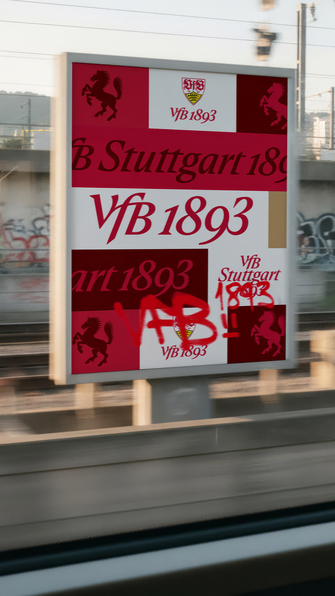
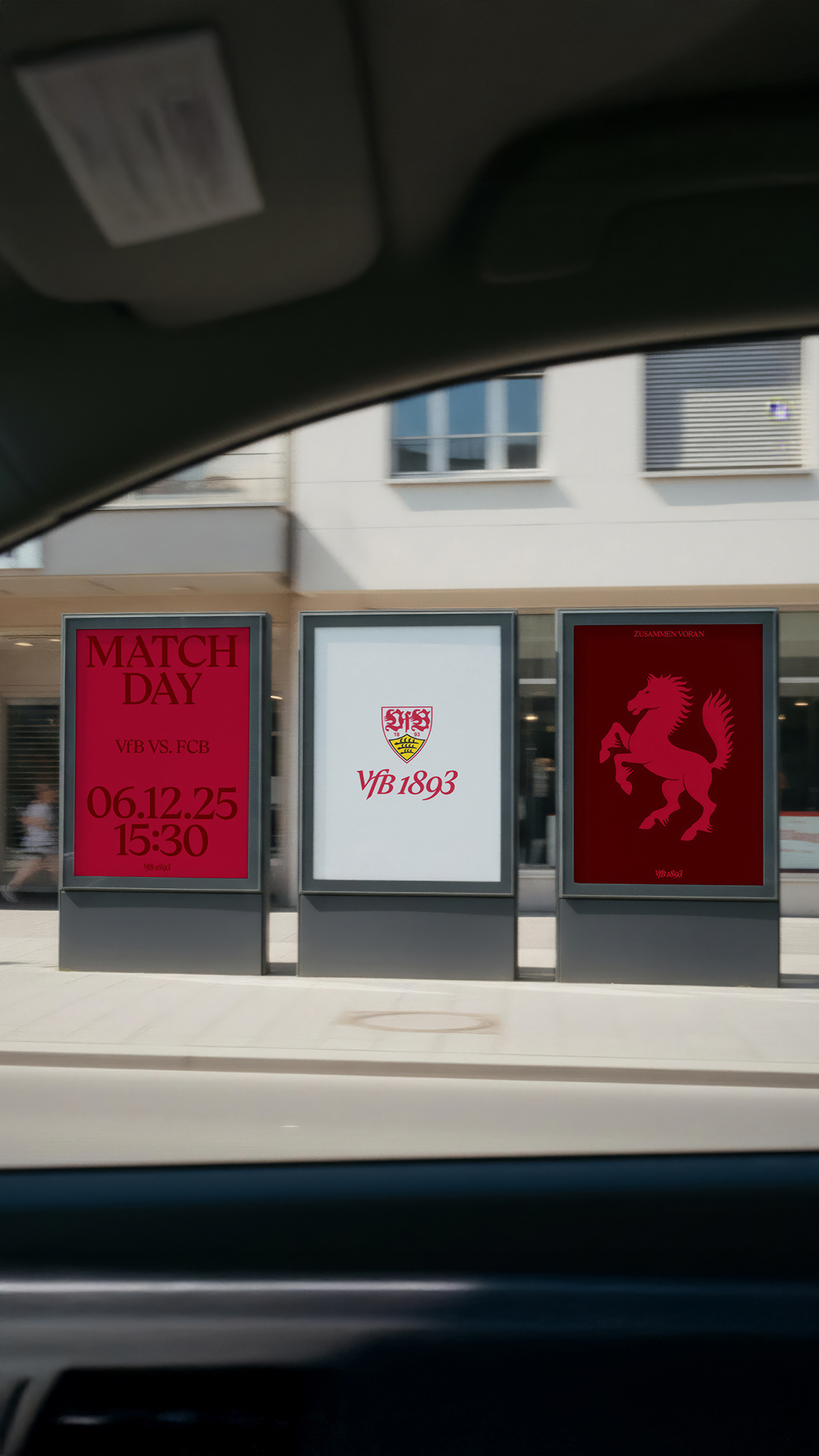
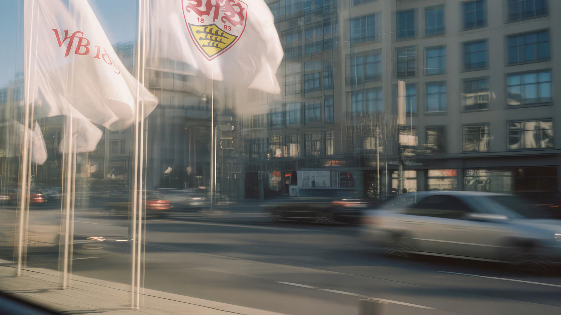
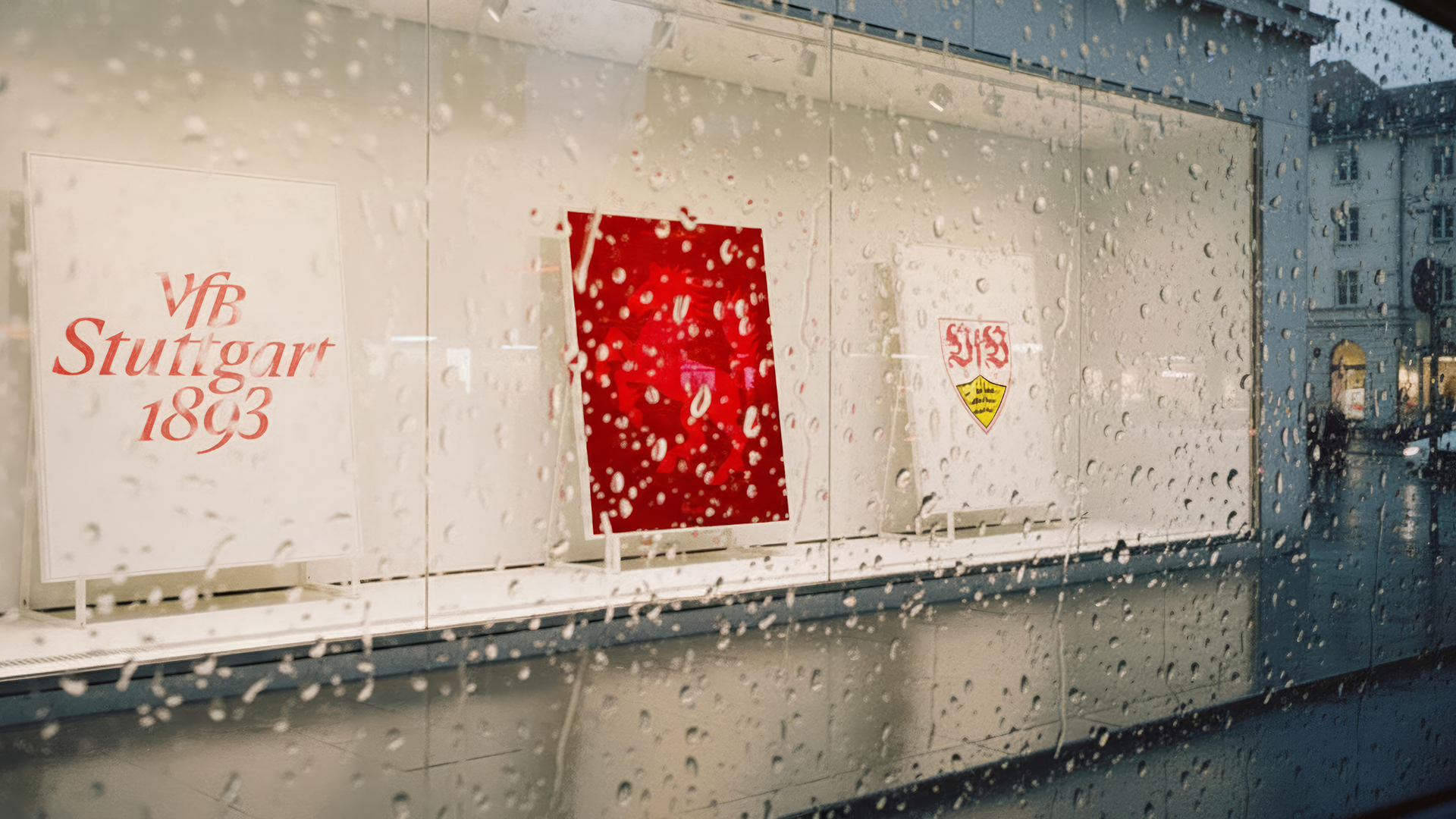
The tradition-steeped VfB crest remains unchanged. It is and always will be a source of immense pride and embodies our identity – it is a symbol of movement and togetherness.
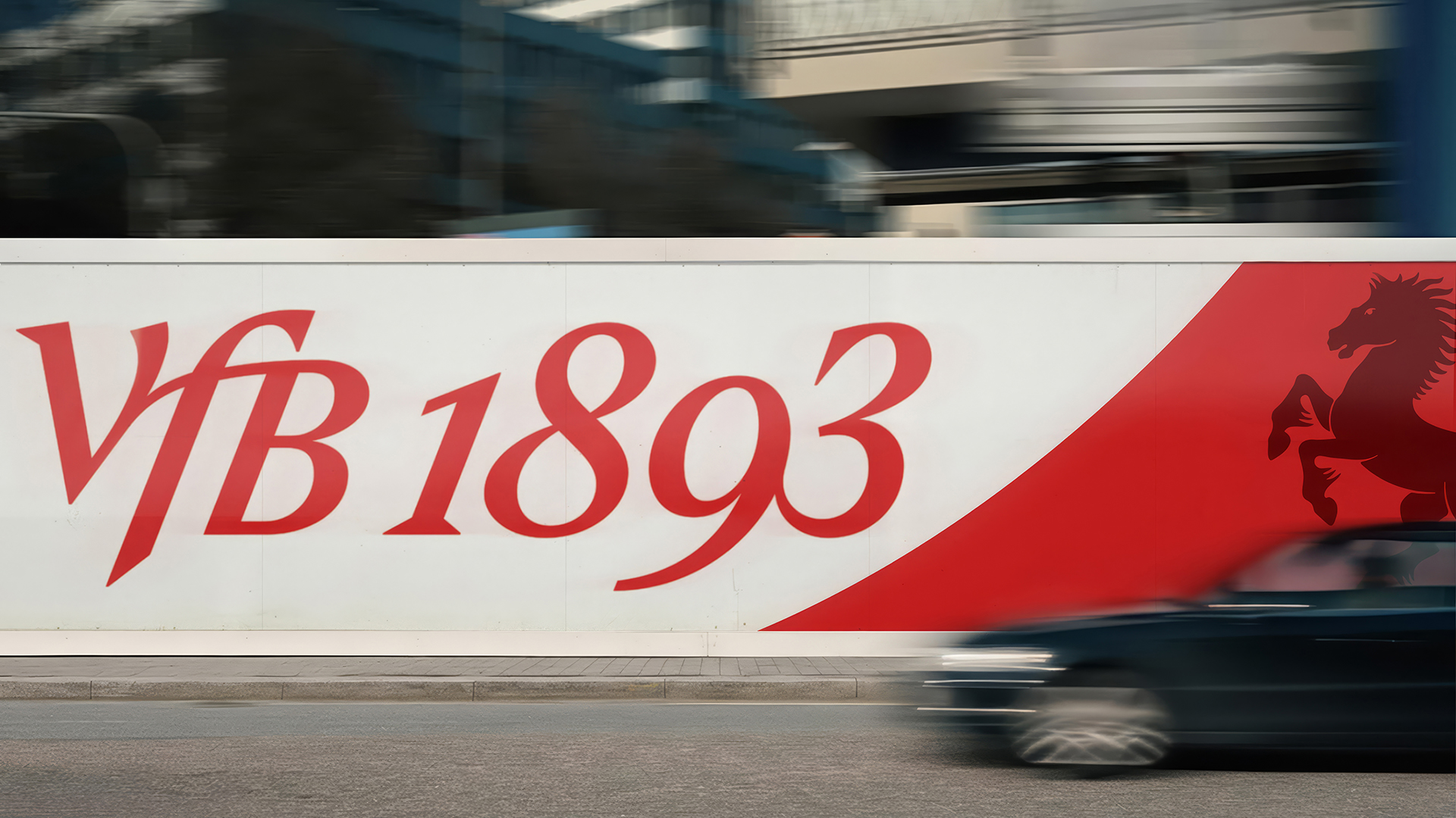
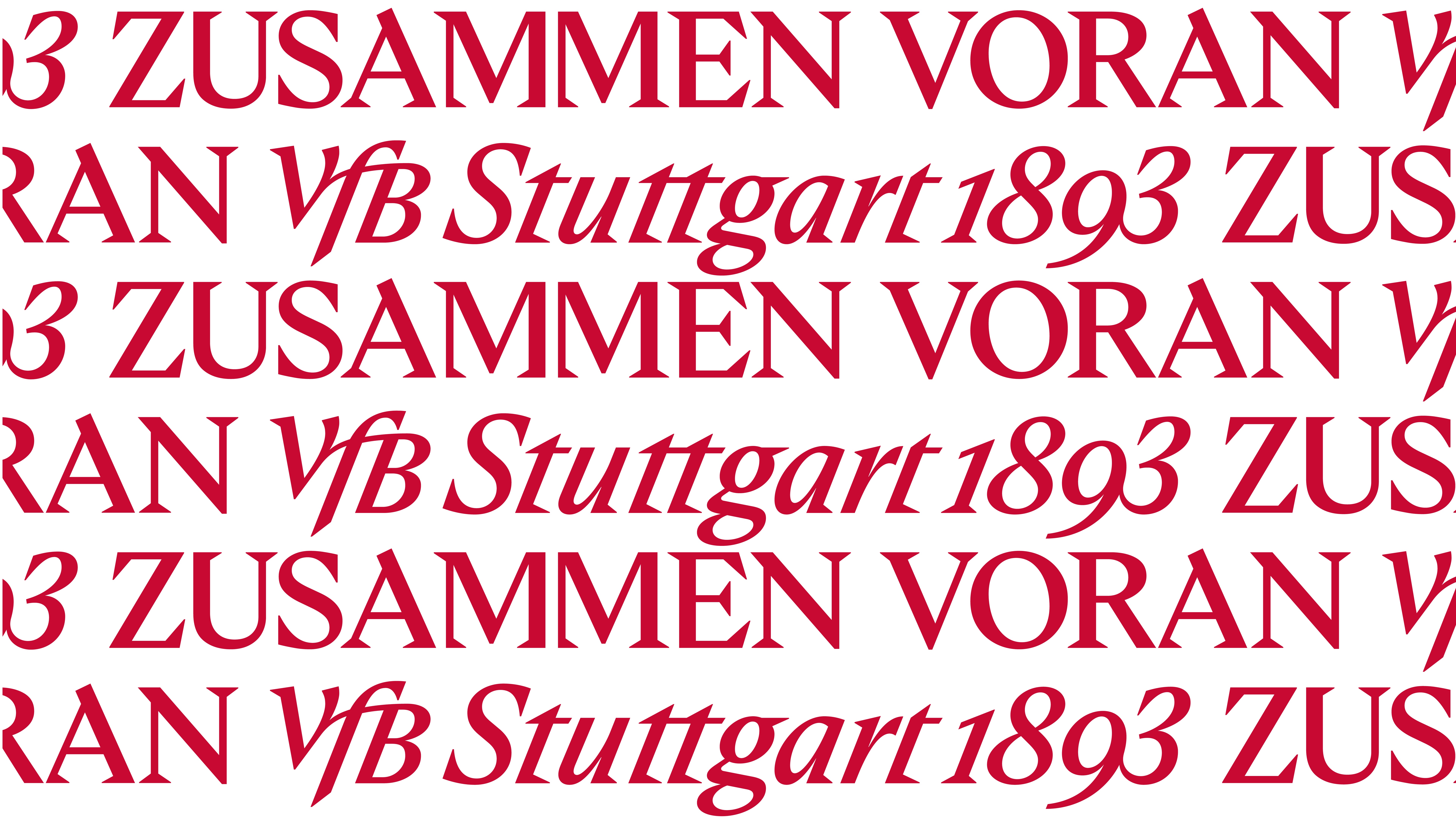
In addition to our crest, we are introducing a new wordmark in three variants, which represents our DNA. Derived from the VfB emblem, it is a visual emphasis of the togetherness and movement which are integral parts of our identity. The wordmark transports our identity and provides clarity and recognition value – including in contexts where the crest is not present.

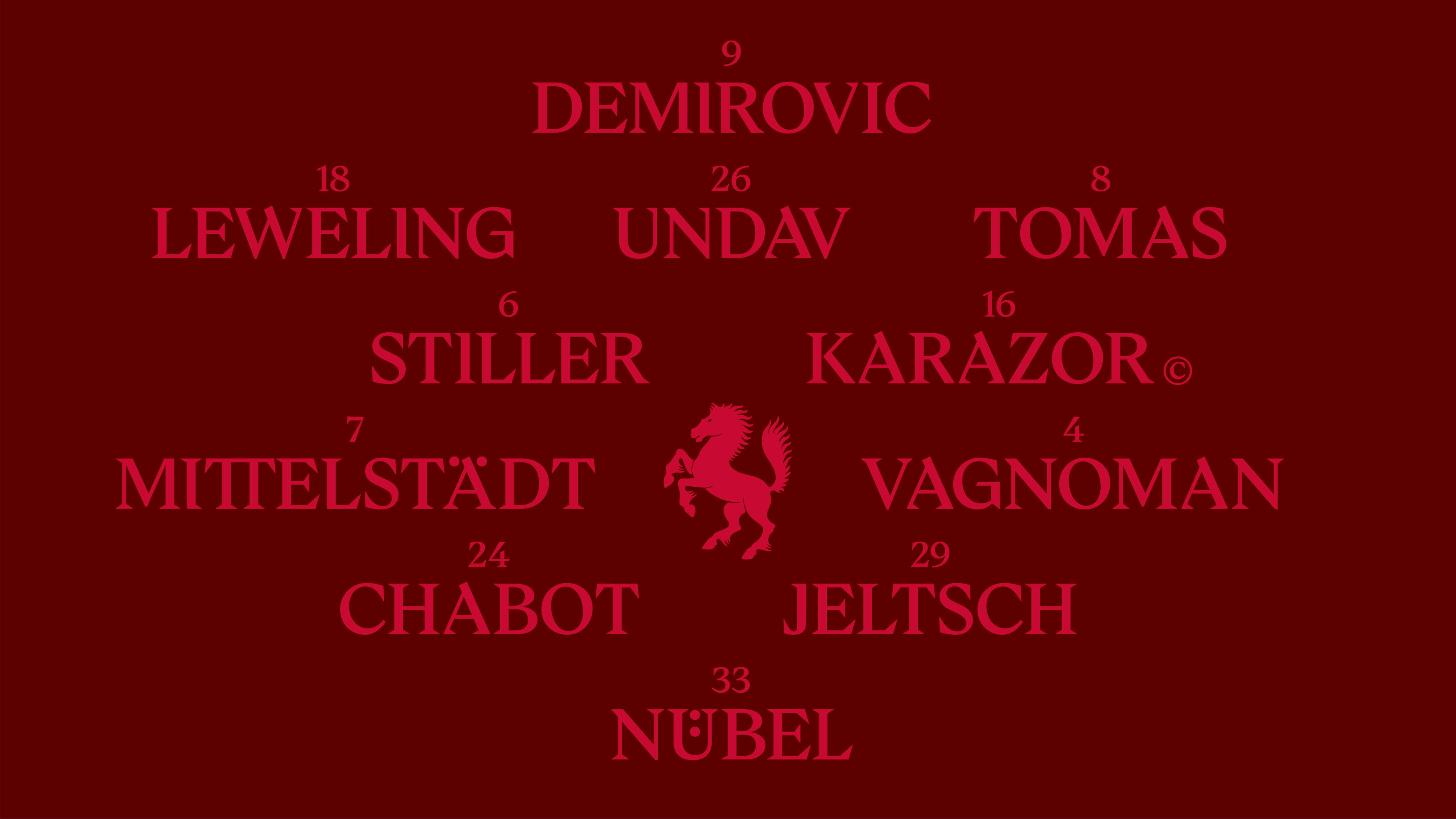
We are bringing the ‘Rössle’ (little horse) even closer to our club as the perfect symbol of movement. It has been shown to feature on the city’s coat of arms ever since the 14th century, and for decades has been used by VfB fans as a symbol of the close ties between our club and its home. The prancing horse embodies drive, energy and movement – qualities which we bear in equal measure in our DNA and our name.
With Concordia, we now have our own font for the first time in 132 years. Inspired by the typography of the former Concordia Hotel in Bad Cannstatt – the historic location where the two predecessor clubs came together to form the ‘Association for Movement Games’ in 1893 – this unmistakable typography embodies the bridge between past tradition and the future. The serifs are the most eye-catching feature, giving this combination its unique appearance.
Our club colours are, and always will be, white and red. How we use them is our way of being accountable when it comes to accessibility – for example in the digital space.
Dark red has now been established as the identification colour of our members and will henceforth be used as an extension of the vibrant palette of our brand communications.
The hoop on our jerseys is by far and away the most recognisable symbol of our club, with a reach far beyond the city, the region and even the country’s borders. It remains one of our central design elements with a deep sense of significance, and has been a unique feature our club for over a century. Changes in the perspectives to the hoop on our jerseys will help to bring it to life, and henceforth it will be a symbol – both static and in movement - and truly represent its role as a hoop.